Tokyo 2020

Tokyo 2020

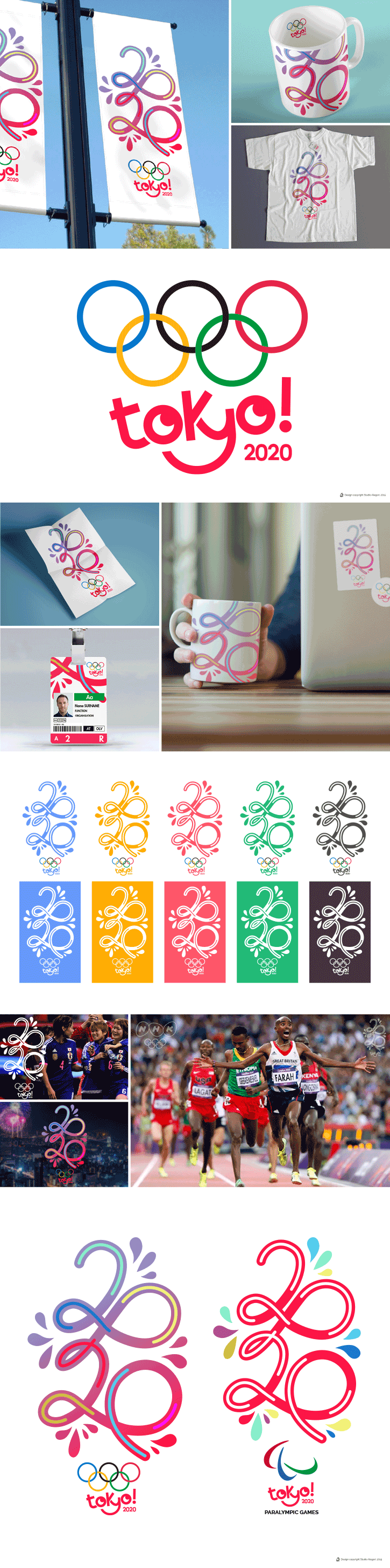
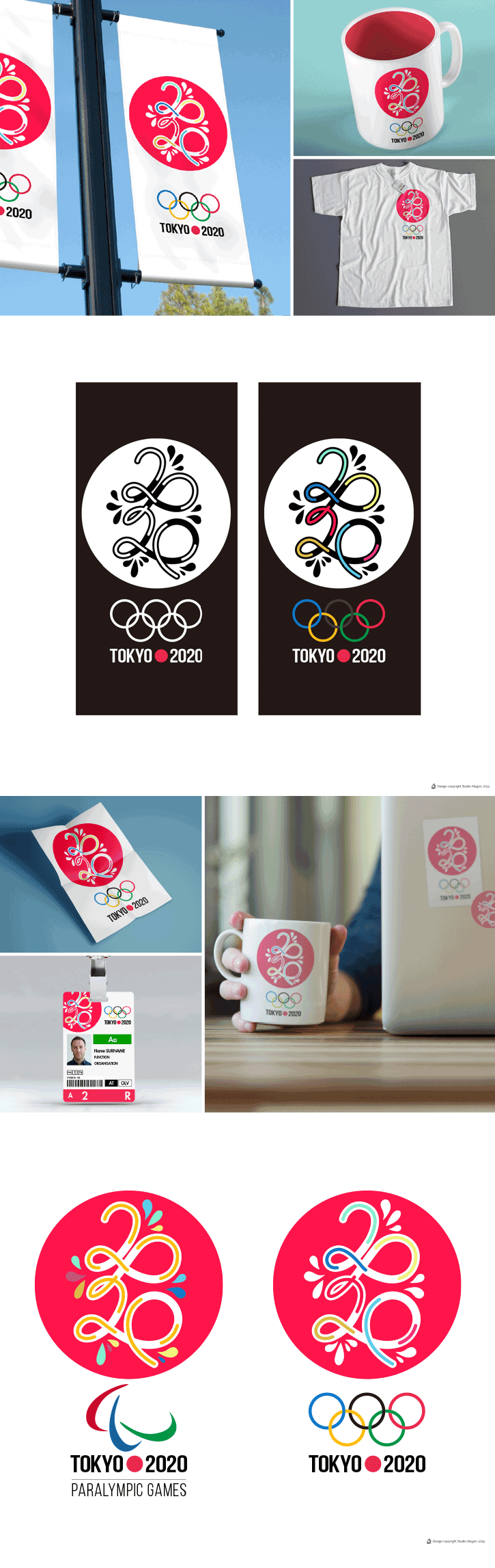
Tokyo 2020 – Games of the XXXII Olympiad / Jeux de la XXXIIe Olympiade

We took part in the international competition for the creation of the new identity of the Tokyo 2020 Olympic Games (in December 2015)
This is what we proposed.

Color Lines

One of the reasons why we love Tokyo, is this unique mix of urban culture, young, trendy and dynamic, and the traditional Japanese culture, ancient and serenely beautiful.
And all these elements blend into a harmonious and beautiful balance, which Japanese people only have the key.

I wanted to create a logo that would express this characteristic that, as a French, fascinates me.

In the shapes of the number ‘2020’, the colored and modern lines and curves, (laid on the traditional shape of Hinomaru in the logo 2), are expressing this idea of mixed culture, urban art and traditional heritage.
The curves themselves represent the pathway or ‘parcours’ of the different fields of Olympic disciplines (such as the circular track layout of the athletics stadium, or the path of a marathon…).
In the middle of these curves, the colors in movement represent the women and the men who – competing in different sports, teams, nations, colors – are contributing together to the creation of the number ‘2020’, and at the same time, symbolizing the existence of the Tokyo Olympics 2020.

Between these tracks / paths, these sparkles represent both the joy and the public fervor, but also the glitters of the fireworks, in the delicate Japanese shape of a petal of a sakura flower.

Last but not least, we are convinced that using a trendy and modern style for the Olympic logo will be also useful to give a young and popular image to the Games, to target not only the usual audience, but also the youth around the world.

Date

July 26, 2016